An Interview With Prayer Book Illustrator, Matthew Alderman
Matthew Alderman
The Emperor Karl League of Prayer U.S.A. and Canada was pleased to collaborate with renowned liturgical illustrator and designer Matthew Alderman on the new Gebetsliga Prayer Book. The League commissioned Alderman to complete six illustrations to compliment the prayer book sections and text. His artwork has been featured in numerous publications including: Sacred Architecture, First Things, Antiphon: A Journal of Liturgical Renewal, and The Living Church. In 2010, he completed 15 full-page illustrations for Liturgy Training Publications' landmark altar edition of the Revised Roman Missal, and in 2011, he produced over 50 illustrations for HarperCollins UK's Sunday and Weekday Missals.
League Webmaster and Designer Jordan Hainsey, who worked with Alderman in formulating the motifs and themes in the illustrations, recently sat down with Alderman to discuss his work illustrating the Gebetsliga Prayer Book along with his artistic inspiration and design process. We are pleased to share the interview below.
A previous private commission by Matthew Alderman entitled, "Emperor of Peace," served as the inspiration for the Gebetsliga Prayer Book illustrations commission. "Emperor of Peace" is featured as the frontispiece in the prayer book.
When did you first come to know about Emperor Karl?
I’m not sure when I first learned about Emperor Karl. I remember preparing for a childhood vacation to Vienna and coming across an illustration of him in our guidebook. My parents strongly encouraged a love of art and history through travel. The guide also described in detail the old Habsburg funeral rite wherein the dead emperor’s coffin is heralded with a long list of worldly titles, but only permitted to enter the vault when the chamberlain announces the deceased as “a poor sinner.” This made a significant impression on me, and certainly fostered my growing interest in the Habsburg dynasty and their heritage of Catholic piety. I think I first heard of his beatification when I was in middle school—the idea of a saintly monarch, a spiritual successor to Charlemagne, bearing the holy crown of Saint Stephen on his head, striving to bring peace in the midst of modern war, was absolutely arresting.
Your work is characterized by bold lines and red and black ink; where do you draw your inspiration?
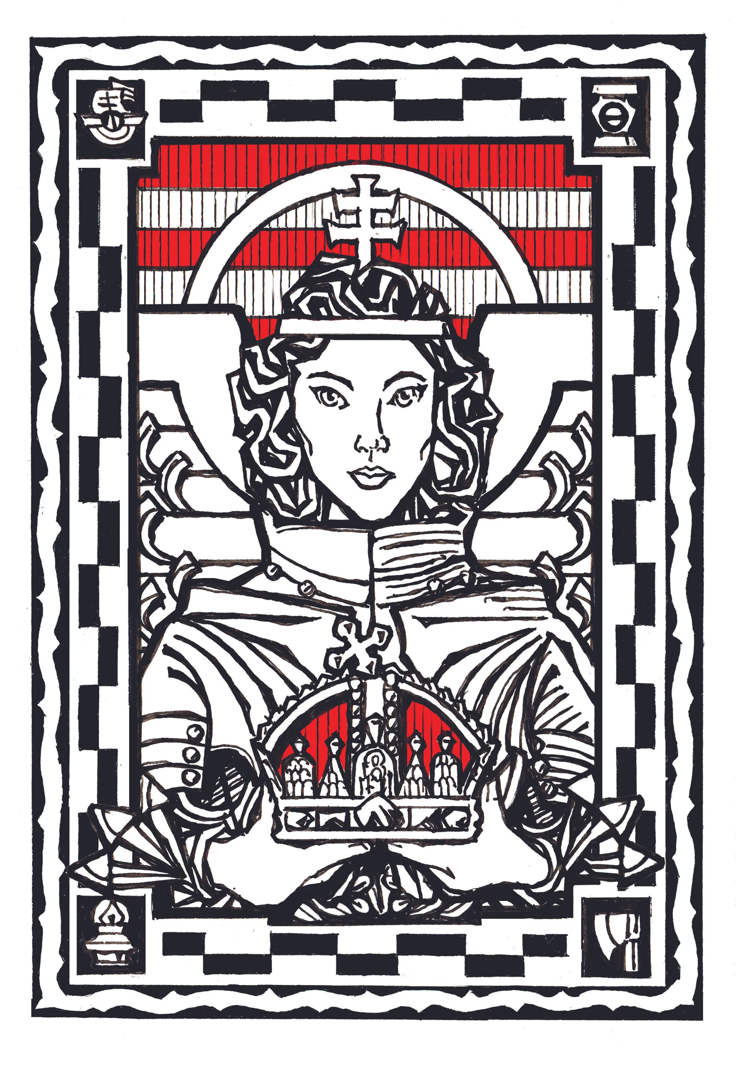
I’m inspired by a variety of sources. My earliest work drew very heavily on the woodcuts of the German Renaissance artist Albrecht Dürer, but I’ve also become quite enthralled over the years by many early twentieth-century artists and designers whose work strikes me as “modern” and original while still linked with tradition—the British Martin Travers, who worked in an exuberant and sometimes childlike take on the Baroque, the unclassifiable work of the Irish stained-glass designer Harry Clarke, and the more angular styles of the Wiener Werkstätte and Koloman Moser. The latter two were the principal artistic sources for this commission, as they were very much a style that was in vogue in the time of Emperor Karl. Koloman Moser was an artist, illustrator and interior decorator of the Vienna Sezession, and did numerous commissions for the Church and Austro-Hungarian state, including stamps featuring Karl and Zita. Unfortunately, he also left Catholicism while in the midst of one of his ecclesiastical commissions, but that does not lessen the impact of projects such as Moser’s interior for Otto Wagner’s chapel at the Steinhof mental institution in Vienna. Karl’s Austria was a “modern” Catholic state—it’s easy to paint Austria-Hungary as a sort of quaint Ruritania, for good or ill, but then you read that, say, Budapest, had the world’s third-oldest electric metro system, before even London. And yet, at the center of all this was an emperor who walked, candle in hand, in every year’s Corpus Christi procession! Karl, however unsuccessfully at the end, sought to bring a sense of monarchic, chivalric concern for the poor and downtrodden in the harsh realities of his times.
None of the drawings are direct or indirect copies of Moser’s work, or the graphic designs of the larger Werkstätte collective, but are certainly informed by them, and borrow some elements of their stylistic and ornamental vocabulary, with perhaps some of their more mannered tics smoothed out and brought in line with an explicitly sacred approach. Obviously, it is essential when using more “modern” styles to fully “baptize” them, to imbue them with traditional symbolism and beauty even if the lineaments are somewhat novel. I hope they will inspire more artists to seek out some of the lesser-known movements and schools that had traditional roots but are an “other modern,” an alternative to the destructive modernistic culture that swept so much away spiritually in the wake of the material destruction of the First World War.
What was it like to work on artwork featuring Emperor Karl and Empress Zita?
It was an absolute delight to work on the images of Karl and Zita. I know their story in outline well, but as relatively modern figures who have had little iconography established for them, it was an exciting challenge to draw on ancient precedents in order to tell their unique story through the Church’s vocabulary of symbols. Jordan was kind enough to provide suggestions of symbols to help refer to individual stories in their lives or various virtues they embodied. Sometimes illustrating these was a bit of a challenge—yes, I could illustrate a salt jar to represent “the salt of the earth,” but how to show it is actually salt inside? I found myself frantically looking up old alchemical symbols for salt to try to find something that worked!
What made this project unique for you?
So many things. I think how closely the final drawings became integrated into the layout and content of the prayerbook made it particularly unique. At a spiritual level, being able to contribute to Karl’s cause at an artistic level represented a particularly unusual challenge. Furthermore, as Emperor Karl was also a knight of Malta, as I am, the commission as a whole was also very meaningful and distinct—and gave me an example that is a bit daunting to consider, given how much he sacrificed, as both knight and monarch.
What is your artistic process consist of when composing an image?
To some degree, this is best seen in the process sketches themselves, but there are a few specific things worth mentioning. I look at a lot of different sources before beginning a work. For example, in this case, I paged through my own collection of books on Jugendstil and Sezession, through image files of various faces for inspiration for the angels, books on Austro-Hungarian imperial symbolism and heraldry—it’s actually a project that in some way I have been unintentionally preparing for much of my life, I think! Then, I block out the sketch loosely in pencil. In this case, I had the existing image of Blessed Karl as a starting point, but I had to think of ways to vary the other images in their details, such as the borders with their various symbols, to avoid it appearing repetitious. I wanted a unified set that nonetheless presented something unique in each image. I do several iterations in pencil, refining the design at each turn, and produce a semi-final pencil drawing on clean translucent rag paper. Then, I finally add ink and clean off the remaining visible pencil lines. In this case, I also did some digital editing in Photoshop afterwards, to tie in repeated elements, in order to streamline the process and save time, given we were somewhat on a bit of a deadline crunch.
How was the artistic dialogue between the Gebetsliga and you as the artist?
Extremely enjoyable, very respectful of my prerogatives as an artist, and also very helpful in making the results even better than I had anticipated—I was grateful to the Gebetsliga to suggesting subject matter for some of the images when my own intellectual well ran dry, for Jordan’s eye for noticing small details such as Karl’s fingers in one image, that needed minor clean-ups at the end—sometimes it’s possible to be too close to something for you to actually see it. The Gebetsliga did something very original here by commissioning new artwork for the prayerbook, and I appreciate greatly their making the art such a big part of the finished publication rather than something merely incidental. It’s humbling for me that they allowed me to be a part of this whole process in a special way.
What is your favorite image from the commissioned set?
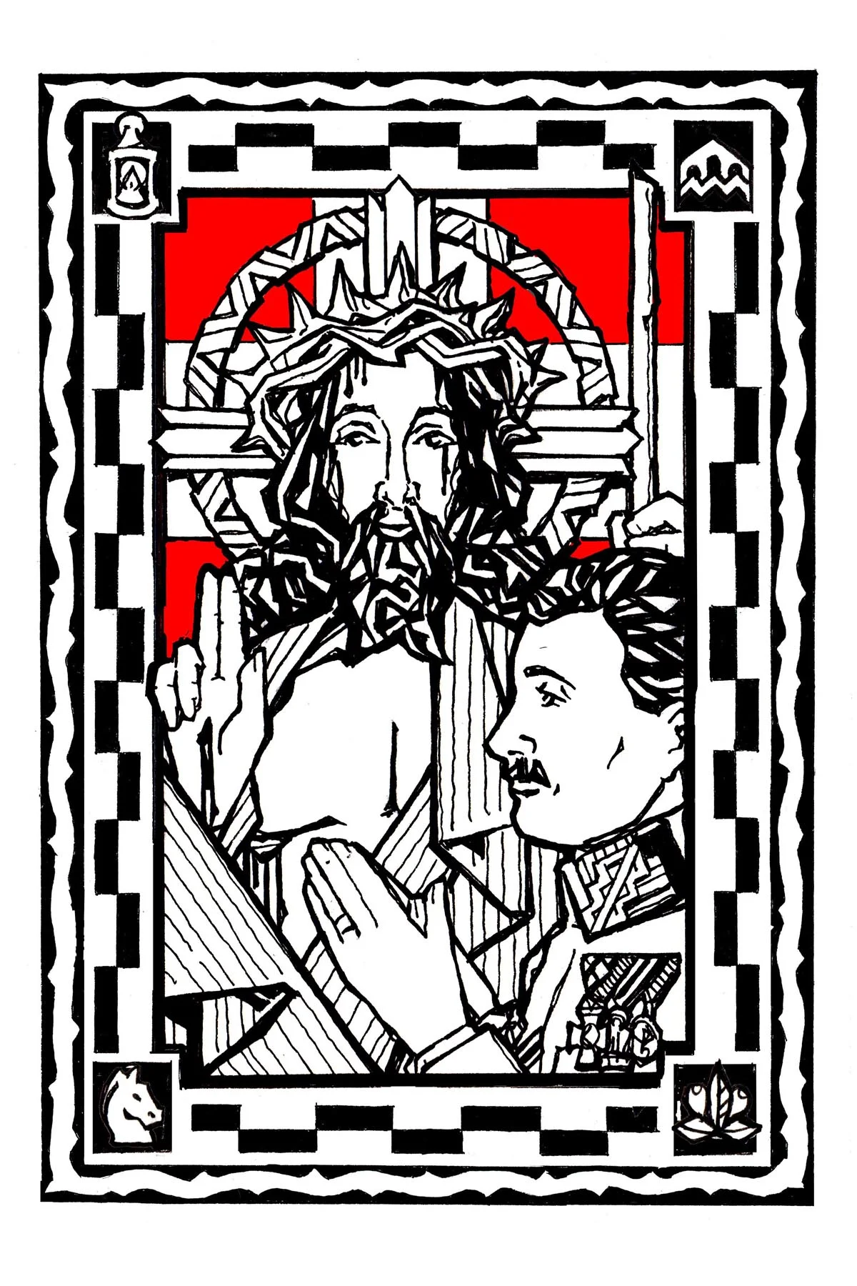
That’s a bit like asking a father what his favorite child is, and I’m bad at picking favorites, but it’d probably have to be Karl before the Suffering Christ and (I hope I can pick two) Karl and Zita together. The first, because I’m quite happy with the way it came out, and also because it does highlight the link between Christ’s passion and the sacrifices Catholic leaders are called to, and the second because Karl and Zita’s relationship is so tied to their story of sanctity. Also, the mystique of the Holy Crown of St. Stephen, which Karl is shown wearing, adds so much to the finished image.
What does it mean to you to have these images accompany a prayerbook that will be used by the faithful in promoting the Cause of Canonization of Blessed Karl?
Working for the Gebetsliga, so closely tied into Blessed Karl’s canonization, is about as close as one can get to actually having the future saint as a client! I certainly prayed to both Karl and Zita to inspire me to do their lives justice in my art. That isn’t necessarily unique to this one project—I hope all my work can be an aid to prayer, and be animated, however imperfectly, by my own faith, but it was particularly special here because of the fact the final product would be so uniquely tied into the veneration of the Peace Emperor and hopes for his future canonization.
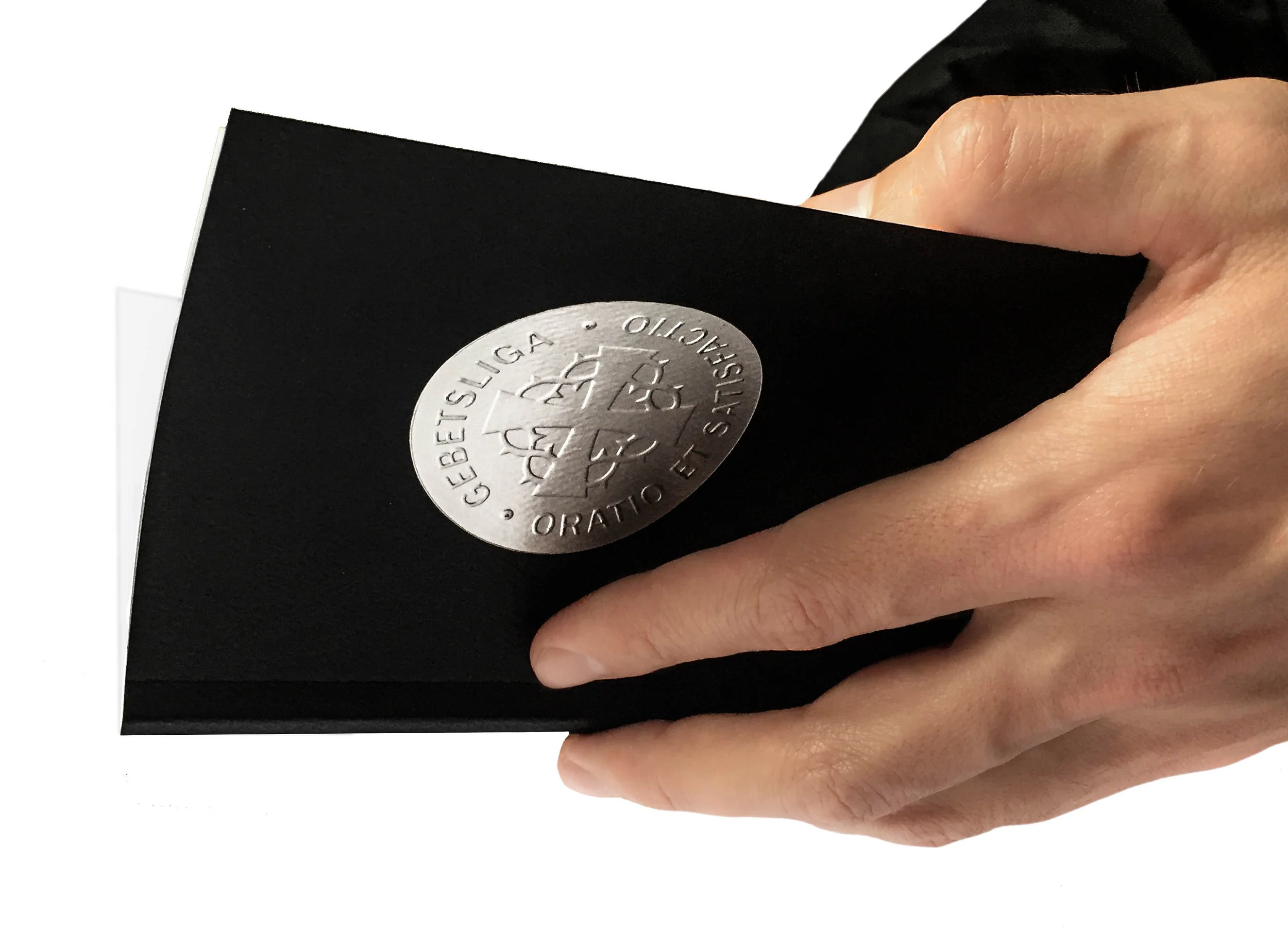
Gebetsliga Prayer Book Available!
The official Gebetsliga Prayer Book is available in our online store by clicking the link below.


